
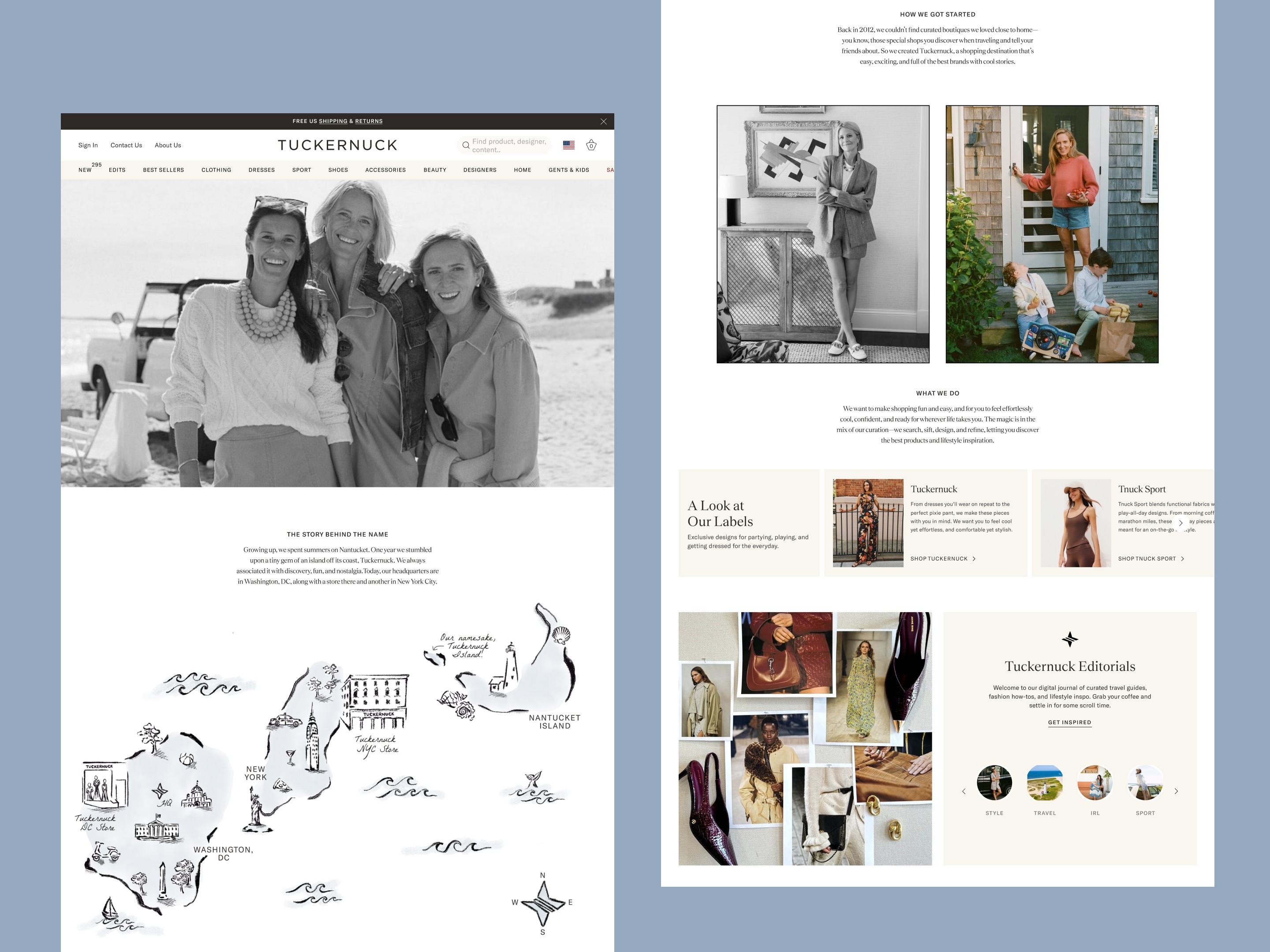


Tuckernuck
Tuckernuck's website was reimagined to meet the polish of a brand that never drifts from its aesthetic. Considered, classic, and rooted in the brand's "classic with a twist" sensibility, the new design gives proper space to styling and story alongside the clothes themselves.
About
Full UX and UI redesign across PDP, PLP, navigation, and homepage, plus new interface work for personalized gifting, monogramming, Shop the Look, buy-online-pickup-in-store, shoppable UGC, and a custom size chart, along with loyalty touchpoints woven into account views and checkout.
The Brand
Tuckernuck launched in 2012 in DC, founded by three women with no fashion background, on one bet: define the customer precisely and never drift from the aesthetic. "Classic with a twist," ribbon belts, tweed, monogramming, the kind of put-together that doesn't announce itself. It's built for ambitious, professional women who want to look pulled together without spending real energy getting there.
Objectives & Goals
I was brought in to lead a full redesign and rebuild of the site, translating that "classic with a twist" identity into UI that could carry real ecommerce weight. The relationship didn't end at launch. It became an ongoing design partnership: continuously refining the experience as the product line, customer base, and business kept growing.
Platform
Shopify
Design Credits
Creative Director: Lenora Rigoni Design Director: Lenora Rigoni & Rae Verrengia UX Director: Katie Baligod UX Designer: Suzi Hyun Agency: Domaine
Discussion of Creative & UX
The interface had to hold two things at once: brand expression and conversion-focused commerce. Monogramming and personalized gifting are easy to make feel like add-on features bolted onto a template. Here, they needed their own considered flows, clear enough that customization never slows down checkout, distinctive enough that they still feel like Tuckernuck rather than generic Shopify. Shop the Look connects editorial outfit inspiration directly to product discovery, so styling does double duty as merchandising and reinforces the brand's lifestyle positioning instead of just listing SKUs. Loyalty touchpoints were designed into account views, order history, and checkout rather than isolated on a separate rewards page, so retention feels like a natural part of the shopping experience instead of an interruption. The custom size chart and BOPIS flows got the same treatment: unglamorous UX work that matters most in the moment right before someone decides to buy.